 Glyphfield
Typography
Edit the brand type system with four roles, a modular scale and variable font axes, check specimens, wrapping and licenses, and copy the type tokens.
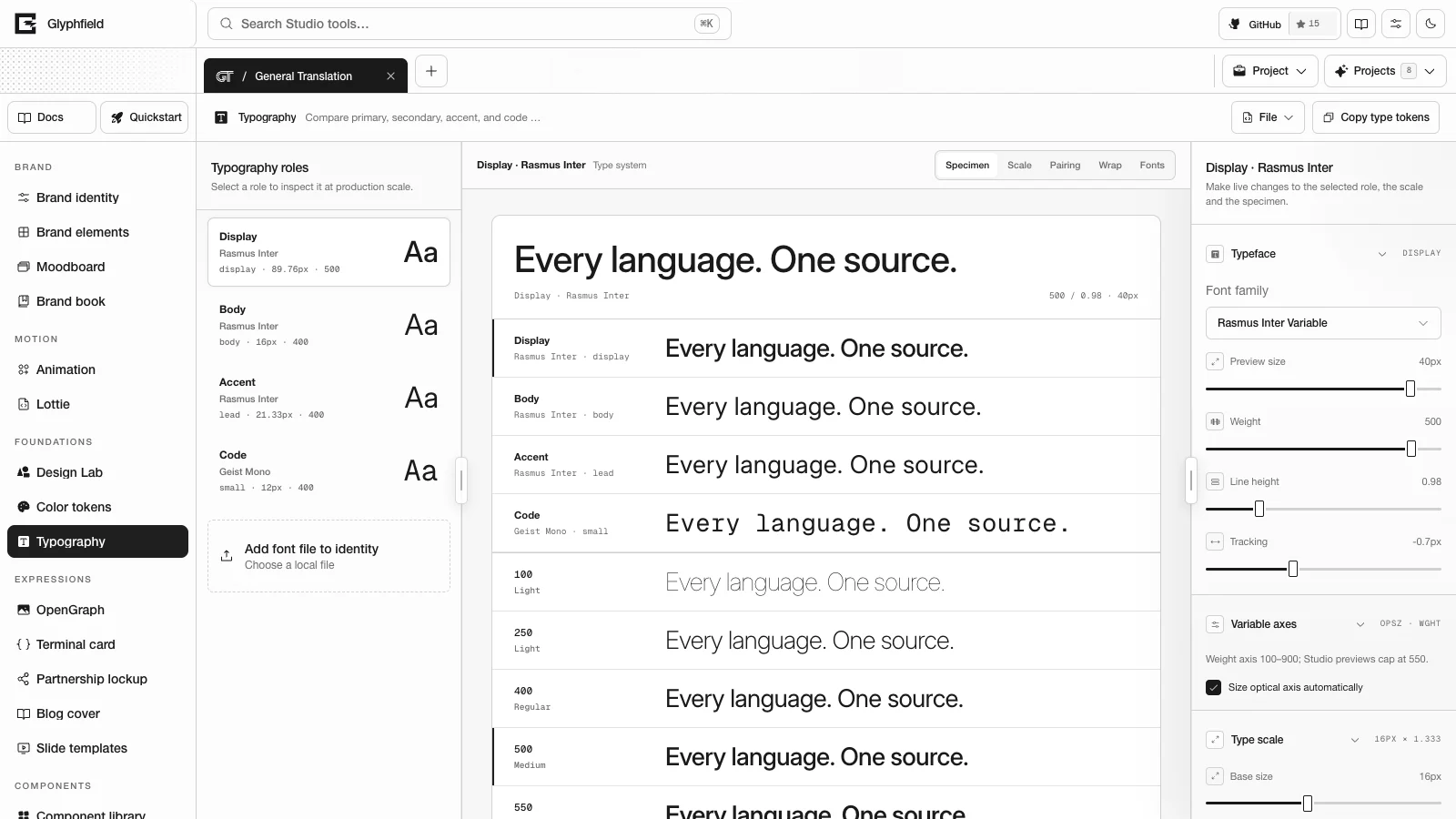
Typography (tool ID typography) is the Glyphfield Studio tool that edits the active brand identity's four type roles (Display, Body, Accent and Code) and its modular type scale. Changes write to the identity as pending changes. Select Save changes in the save notice to keep them, or switch to Brand identity and call identity.save.
Layout
| Region | Contents |
|---|---|
| Tool header | File (Advanced → Edit source code) and Copy type tokens |
| Left sidebar | Typography roles: the four roles in their own faces with family, scale step, size and weight, and Add font file to identity |
| Canvas | The view buttons Show Specimen view, Show Scale view, Show Pairing view, Show Wrap view and Show Fonts view |
| Right sidebar | The selected role's sections |
Roles
Add font file to identity stores an OTF, TTF, WOFF or WOFF2 file with the identity. The family name comes from the file name. "Bold" in the name sets weight 700, and "italic" sets the italic style. No license is recorded, so add one in Brand identity.
The inspector edits the selected role:
| Section | Controls |
|---|---|
| Typeface | Font family (a stored font file), Preview size (10 px up to 44 for Display, 30 for Body, 36 for Accent and 24 for Code), Weight (100–550 in steps of 25), Line height (0.7–2) and Tracking (−8 to 12 px). Dragging a slider previews live, and releasing commits the change. |
| Variable axes | The axes read from the font file. When the font has an optical size axis (opsz), Size optical axis automatically keeps optical sizing automatic. Turn it off to set a fixed Optical size. When the font has a slant axis (slnt), Slant sets the angle. A font without these axes says so. |
| Type scale | Base size (10–24 px), Named ratio (Minor second, Major second, Minor third, Major third, Perfect fourth, Augmented fourth, Perfect fifth or Golden ratio), Ratio (1.067–1.8) and the scale step of the selected role |
| Specimen | Sample text, alignment (Left or Center) and Measure (30–90 characters) |
| Role guidance | The guidance below for the current roles, and Apply recommended tracking |
| Type tokens | The type section of the brand tokens as CSS variables, a Tailwind v4 theme or DTCG JSON, with Copy type tokens |
The axes are read in the browser. A WOFF2 file needs a browser that can decode Brotli, and a WOFF file needs DecompressionStream with deflate. Otherwise the axes show as not readable.
Modular scale
Each size is basePx × ratio^step across nine steps. The default is a 16 px base and a 1.25 ratio. The steps are caption (−2), small (−1), body (0), lead (1), h4 (2), h3 (3), h2 (4), h1 (5) and display (6). The named ratios run from the minor second (1.067) to the golden ratio (1.618). By default Display is set at display, Body at body, Accent at lead and Code at small. Any role can move to another step, which is stored in typeScale.roleSteps. The Scale view shows every step at its size with the roles set on it. Select a step to set the selected role there, or pick a ratio from the chips.
Guidance
Typography checks every role at its scale size. Display sizes are 28 px and larger, and the Code role always counts as text.
| Check | Rule |
|---|---|
| Leading | The recommended range is 0.95–1.15 for display sizes and 1.4–1.7 for text. A warning starts below 0.85 or above 1.25 for display sizes, and below 1.35 or above 1.8 for text. |
| Tracking | Display sizes take slight negative tracking, −0.01 to −0.025 em. A warning starts below −0.035 em or at any positive value, and a note appears above −0.005 em. Text sizes use 0, with a warning beyond ±0.01 em. Code is flagged below −0.005 em. |
| Measure | 45–75 characters per line for body text |
| Scale | Warnings for a base below 14 px or a Display role less than 1.5 times the body size. Notes for a ratio below 1.125 or above 1.5. |
| Weight | Body text below weight 300 |
Apply recommended tracking sets −0.02 em on display-size roles and 0 on text roles whose tracking breaks the rule.
Views
| View | Contents |
|---|---|
| Specimen | The selected role at its preview size as an editable specimen, every role on one line, the weights of the family, and a typing meter (words per minute, words, characters and seconds). Typing in any line edits the same sample. |
| Scale | The modular scale with sizes in px and rem and the roles set on each step |
| Pairing | The roles together on one surface (Display on the primary color, Body, the alphabet and numerals, and Code), then every display face in the brand paired with the body face, each with a Use <family> for Display button |
| Wrap | The headline and lead at 320, 480 and 680 px with text-wrap set to wrap, balance or pretty |
| Fonts | Every font file with the roles that use it, its weight range, its variation axes, its license and its source. A file without a recorded license is marked. |
Browser API
The Browser API (window.glyphfield.studio) exposes these actions while Typography is the active tool:
| Action | Input | Output |
|---|---|---|
typography.tokens.read | { format?: 'css' | 'tailwind' | 'dtcg' } | The type tokens as text |
typography.tokens.copy | The same as typography.tokens.read | The copied text |
typography.scale.read | None | The base, the ratio, the ratio name, each step in px and rem, and the step of each role |
typography.guidance.read | None | The guidance list for the current roles, scale and measure |
typography.axes.read | None | Each role's font file and its axes, or null when the file cannot be read |
Source
File → Edit source code shows version 2:
{
  "version": 2,
  "typography": [{ "role": "Display", "family": "Rasmus Inter", "fontId": "inter-variable", "weight": 500, "lineHeight": 0.98, "letterSpacing": -1.2, "opticalSize": 32 }],
  "typeScale": { "basePx": 16, "ratio": 1.333, "roleSteps": { "Display": "h1" } },
  "specimen": { "sampleText": "Every language. One source.", "align": "left", "measure": 64, "previewSizes": { "Display": 40, "Body": 24, "Accent": 32, "Code": 18 } }
}
Roles merge by role. The source can set family, fontId, weight, lineHeight, letterSpacing, usage, opticalSize and slant. Fields the source omits keep their current values. Other fields of the identity's role are kept, and roles the identity does not have are ignored. opticalSize is 6–144 and slant is −20 to 20. opticalSize: null and slant: null remove a fixed axis. typeScale.basePx must be 10–24 and typeScale.ratio 1.067–1.8. A version 1 source ({ typography: [...] }) still applies and leaves the scale and specimen unchanged.
Kerning and type tokens
Specimens render with font-kerning: normal and the kern feature. Optical sizing follows the size unless a role fixes opsz. The type tokens carry the same settings:
--brand-font-kerning,--brand-font-feature-settingsand--brand-font-optical-sizing.- Each role's
--brand-font-<role>-sizeand its tracking in em relative to that size, for example--brand-font-display-tracking: -0.02em. A role keeps its tracking at any size. - In Tailwind, each step's
--text-<step>--letter-spacinguses the same em values. --brand-font-<role>-variationand--brand-font-<role>-styleappear when a role fixes an axis.
Keyboard shortcuts
Typing in a specimen line edits the shared sample. Clear specimen and restart typing meter clears the sample and resets the typing meter.
HTTP
Typography has no HTTP route of its own. POST /api/brand/kit renders the type tokens with the rest of the kit, and POST /api/generate embeds the identity's font files in template SVGs.
Limits
- Weights display up to 550.
- Font files are limited to 2.5 MB when they are added through Brand identity or
identity.font.add. - Axes are read from TTF, OTF, WOFF and WOFF2 files in browsers that can decompress them.
Color tokens
Edit the brand palette as a color system with OKLCH scales, light and dark roles, contrast checks, vision simulation and proportions, then copy it as tokens.
Expression tools
Edit the layered documents behind OpenGraph, Terminal card, Partnership lockup, Blog cover and Slide templates, and export them as PNG, SVG or PDF.