 Glyphfield
Slide templates
Build brand slide decks from 14 layouts with speaker notes and slide numbers, then export a slide as PNG or SVG or the whole deck as one PDF.
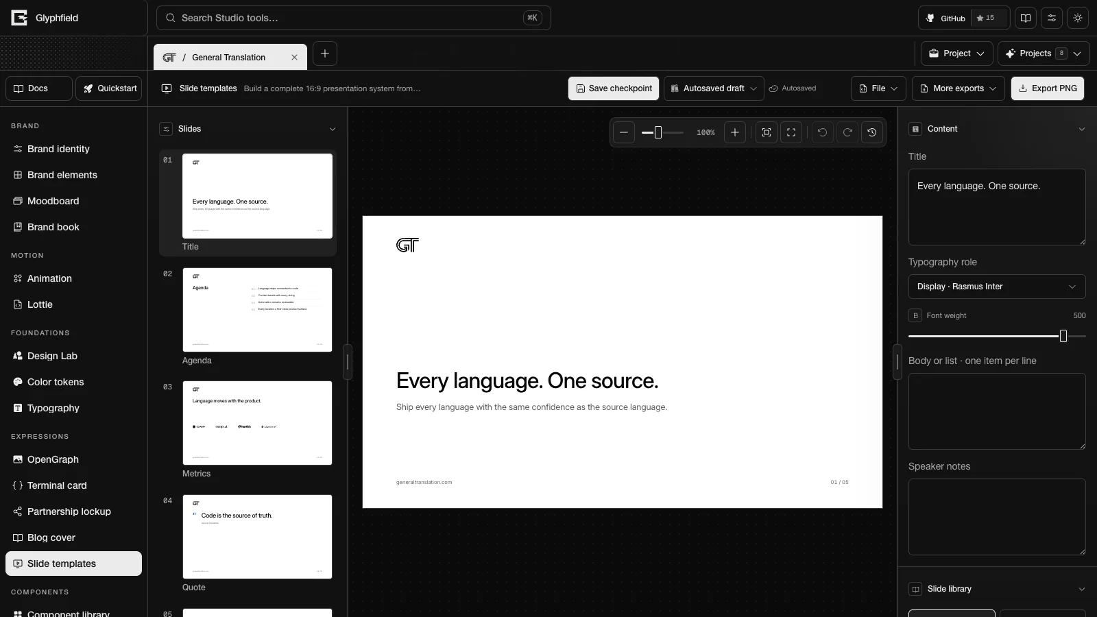
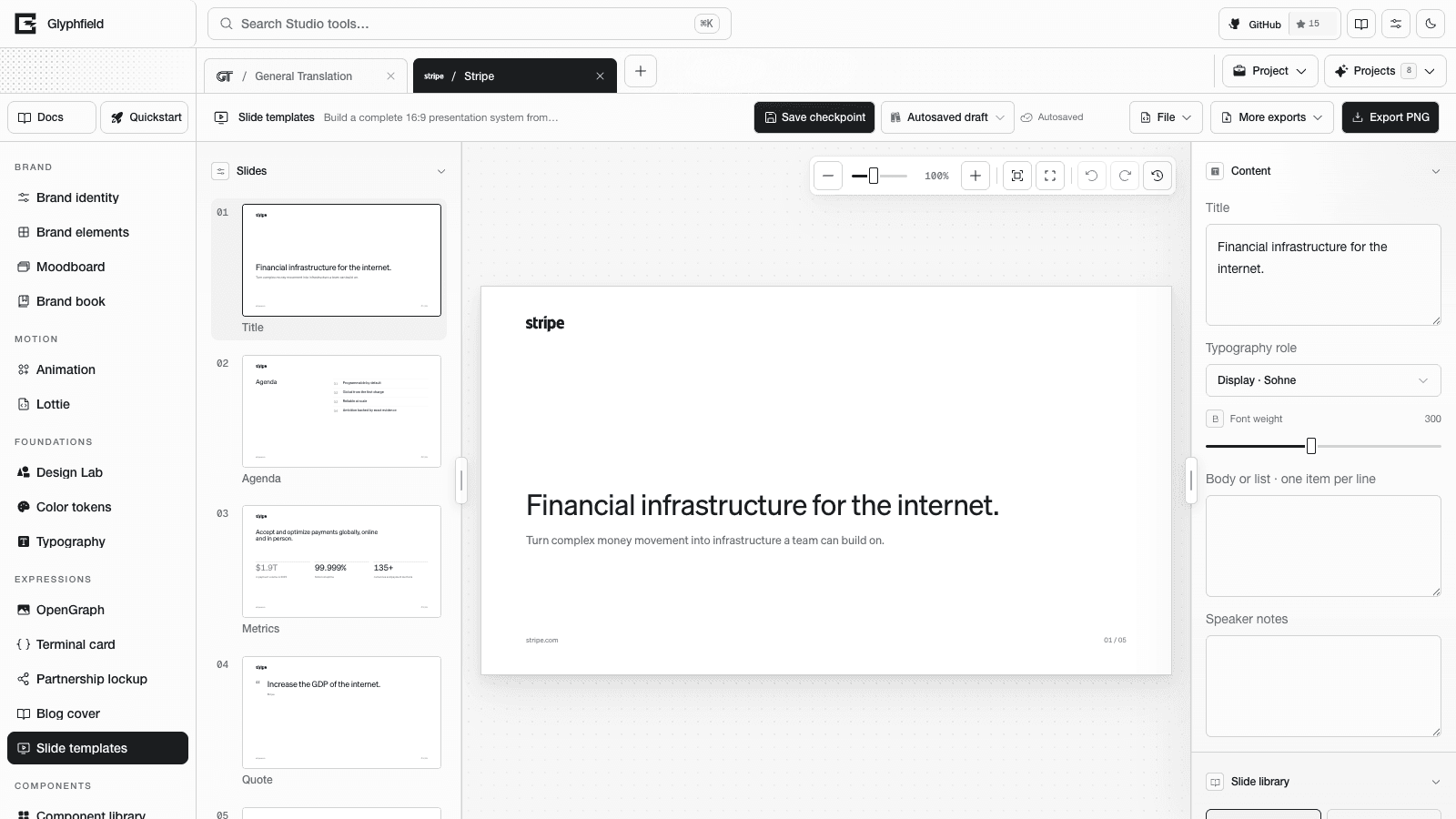
Slide templates (tool ID slides) builds slide decks. It is one of the expression tools. A new deck has five slides built from the identity:
- A title slide with the tagline as the title and the promise as the subtitle.
- An agenda of the identity's strategy pillars.
- A proof slide. It shows the identity's figures as metrics, or its customer logos as a proof wall, or a statement when it has neither.
- A quote in the identity's voice.
- A closing slide with the wordmark and website.
Slides
The Slides section lists every slide with its number and a live thumbnail. Click a slide to edit it. Add slide inserts a slide after the current one in the layout chosen in New slide layout (Statement by default). Duplicate slide, Move slide up, Move slide down and Delete slide act on the current slide. To reorder, drag a thumbnail, or focus it and press Alt + ↑ or Alt + ↓.
Each slide has its own layout. The Slide library section applies one of 14 layouts to the current slide. Each layout ID is the lowercase layout name.
| Layout | ID | Content |
|---|---|---|
| Title | title | A title and a subtitle. The subtitle is left out when it repeats the title |
| Section | section | A section number and a headline |
| Agenda | agenda | Up to 5 numbered items |
| Split | split | A headline beside an image or the brand device |
| Metrics | metrics | Up to 3 proof figures with labels, or a proof wall |
| Quote | quote | A line in the brand voice with an attribution |
| Timeline | timeline | Up to 4 steps on a line |
| Statement | statement | One large centered statement |
| Comparison | comparison | The identity's challenge beside its promise |
| Process | process | Up to 4 steps |
| Chart | chart | A bar chart beside a figure or the promise |
| Team | team | Up to 3 people as initials in circles with names |
| Image | image | A headline beside a framed image or the brand device |
| Closing | closing | The wordmark, a closing line and the website |
Metrics and Chart use the identity's numeric proof. An identity with fewer than two figures gets a proof wall on Metrics instead. The proof wall shows the identity's customer logos as one lockup, or its customer names in the display face, or its proof claims as a ruled list. Chart shows the identity's first figure beside the bars, or its promise when it has no figure. The chart's Values · comma separated and Labels · comma separated fields start with placeholder data for every identity (Q1 to Q5 with 42, 68, 55, 88 and 100), so replace them with real figures. Comparison labels its two panels at their foot with "Before" and "With" followed by the identity name.
Switching layouts keeps the slide's text. The headline, list items, metrics and labels move into the new layout. Text that the new layout has no place for comes back when you switch again.
Content controls
- Content has Title, Typography role and Font weight (100–550) for the headline of the current slide.
- Body or list · one item per line sets the list items of agenda, timeline, process, comparison and team slides.
- Speaker notes are stored with the slide.
- Surface chooses Base white, Base dark, Grid or Noise for the current slide. Add background image, Brand background asset and Background image opacity place and fade an image behind it.
Any text layer can show slide numbers with {page} and {pages}, for example {page} / {pages}. Both numbers are padded to two digits. Templates put the wordmark at the top left, the website at the bottom left and the slide number at the bottom right. The closing slide has the wordmark and website only.
Type rules
Slides follow the shared type scale in Expression tools. On a 16:9 slide, a title is 6–8% of the slide height (67 px on 1600 × 900), and content headlines stay at or below 6% (50 px). Display text has negative tracking, kerning is on, and no layout has a label above its headline.
Formats and export
Formats are 16x9 (1600 × 900), 4x3 (1600 × 1200) and square (1200 × 1200). A format change re-flows every slide.
- Export PNG renders the current slide at 2×.
- More exports → Export SVG downloads the current slide as an SVG.
- More exports → Export PDF deck renders every slide at 2× into one PDF. Each page is a lossless, Flate-compressed image placed at 0.75 pt per pixel, so a 16:9 slide becomes a 1200 × 675 pt page. The PDF leaves out the speaker notes. The file is
studio-slides.pdf.
Browser actions
| Action | Use |
|---|---|
slides.export.png / slides.export.svg | Export the current slide |
slides.export.pdf | Export every slide as one PDF |
slides.slide.add / slides.slide.duplicate / slides.slide.move / slides.slide.remove / slides.slide.select | Deck management |
slides.document.describe | Format, layouts, slides and layers |
slides.layer.add / slides.layer.update / slides.layer.remove / slides.layer.duplicate | Layer edits |
slides.layer.reorder / slides.layer.select / slides.layer.align | Stack order, selection and alignment |
slides.format.set / slides.layout.apply / slides.template.reset | Format, layout (with an optional pageId) and template |
slides.history.undo / slides.history.redo | History |
slides.slide.addtakes{ layout?, index? }and returns{ pageId }. The default layout isstatement, and the default position is after the current slide. The new slide becomes the current slide.slides.slide.duplicatetakes{ pageId? }(default: the current slide) and returns{ pageId }.slides.slide.movetakes{ pageId, index }.slides.slide.removeandslides.slide.selecttake{ pageId }. A deck keeps at least one slide.
slides.export.png and slides.export.svg export the current slide. To export another slide, select it first. See Expression tools for the shared actions.
HTTP
POST /api/generate with { kind: 'template', template: 'slides', slideLayout?, format?, title?, body? } renders one slide as an SVG. body fills the list items, one per line. See Generation API.
Blog cover
Make editorial blog covers from the identity's voice, with feature images, background images and textures, then export them as PNG or SVG.
Component library
Build 36 product components from the brand tokens, review every state in light and dark mode, and copy their code as React with Tailwind or HTML with CSS.