 Glyphfield
Color tokens
Edit the brand palette as a color system with OKLCH scales, light and dark roles, contrast checks, vision simulation and proportions, then copy it as tokens.
Color tokens (tool ID colors) is the Glyphfield Studio tool that edits the active brand identity's palette and everything derived from it. Changes write to the identity as pending changes, as they do in Typography and Brand identity. Select Save changes in the save notice to keep them, or switch to Brand identity and call identity.save. Every other tool reads the result, including the brand kit, the Component library and the Brand book.
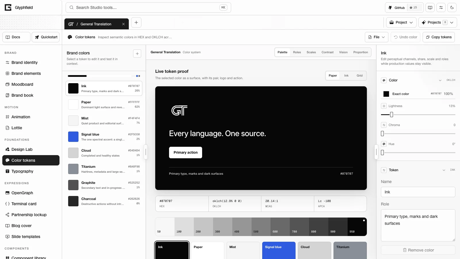
Layout
| Region | Contents |
|---|---|
| Tool header | File (Advanced → Edit source code), Undo color and Copy tokens |
| Left sidebar | Brand colors: every palette color with its role, HEX value and share, the proportion bar, and Add color |
| Canvas | The view buttons Show Palette view, Show Roles view, Show Scales view, Show Contrast view, Show Vision view and Show Proportion view |
| Right sidebar | The selected color's sections |
Palette
The library lists every palette color with its role, HEX value and share of the layout. The bar above it draws the shares in proportion. Add color appends a new color token. Remove color in the inspector deletes a token and every pairing, role override and scale setting that refers to it. Glyphfield tools read the IDs ink, paper, muted and emphasis, so these four can be edited but not removed. The last remaining color cannot be removed either. A new ID must match ^[a-z][a-z0-9-]{0,39}$.
The inspector edits the selected color:
| Section | Controls |
|---|---|
| Color | Exact color, the shared color control (HEX, OKLCH, hue and opacity), plus Lightness (0–100%), Chroma (0–0.4) and Hue (0–360°). Dragging previews live, and releasing commits one undo step. |
| Token | Name, Role, the stable ID and Remove color |
| Share of layout | Proportion (0–100%) |
| Tint and shade scale | Lightest step (50–100%, default 97.5%), Darkest step (0–50%, default 22%), Scale chroma (0–200%, default 100%), Hue shift (−90° to 90°, default 0), Keep the exact brand value as a step (on by default) and Reset scale |
| Contrast check | Contrast color picks another palette color. The result shows the WCAG verdict and the APCA Lc value. |
| Semantic role | Shown when a role is selected in the Roles view. For each mode, a color and a step (Brand value or 50–950). Derive <role> from the palette clears the override. |
| Export tokens | The token preview in the format chosen in Token format, with Copy these tokens |
Undo color restores the previous state, up to 40 steps.
Views
| View | Contents |
|---|---|
| Palette | The selected color as a surface on a paper, ink or grid backdrop with the brand logo, the tagline and a primary action; its HEX, OKLCH, WCAG and APCA values; its OKLCH scale; and every token as a tile. Selecting a tile opens the color editor on the canvas. Escape closes it. |
| Roles | Light and dark product screens painted with the semantic roles, and a role table with each mode's color reference and failing checks |
| Scales | Every color's eleven steps. For the selected color, a lightness and chroma chart and a table with HEX, L, C, H and the contrast on white and on black per step. |
| Contrast | The palette matrix. Rows are text colors and columns are backgrounds. Each cell shows the WCAG ratio and grade or the APCA Lc. |
| Vision | The palette under typical vision, protanopia, deuteranopia, tritanopia and achromatopsia; the product screens under the selected simulation; and the pairs that nearly merge |
| Proportion | A 10 × 10 waffle chart of the shares, a slider per color, Keep the total at 100%, Normalize to 100% and Apply 60 / 30 / 10 |
OKLCH scales
Each palette color has a scale of eleven steps from 50 to 950. Lightness is spaced evenly in OKLCH between the lightest and darkest step, so neighboring steps look equally far apart. Chroma follows the brand color and tapers toward white and black. Each step is then gamut mapped to sRGB by reducing chroma only. With Keep the exact brand value as a step on, the step nearest the brand color's lightness is the brand HEX value itself, and the Scales view marks it with a dot.
A color reference names a palette color or one of its steps, for example ink or emphasis.300.
Semantic roles
Product surfaces read twelve semantic roles in light and dark mode:
| Role | Use |
|---|---|
background, surface, surface-muted | The page canvas; cards, panels and inputs; quiet fills and table headers |
foreground, foreground-muted | Body text and icons; secondary text |
border, focus | Dividers and input borders; the keyboard focus outline |
primary, primary-foreground | Primary actions and selection; text on primary |
positive, caution, negative | Success, warning and error states |
Roles are derived from the palette until you override them. Light mode uses the lighter of ink and paper as the background and the darker as text. Muted text is the quietest step of the darker color that still reaches 4.5:1 on the background. positive, caution and negative use the success, warning and error colors when the palette has them, each moved to its nearest step that reaches 3:1. Without them, positive and caution use the accent and negative uses the text color. Dark mode uses the lighter color as text. Its background is the darker color when that color's OKLCH lightness is 0.3 or less, and otherwise the step of the darker color nearest lightness 0.2. Dark mode moves the accent and status colors to their nearest steps that reach 3:1 on the dark background.
Select a role in the Roles view to override it per mode with a palette color and step. Derive <role> from the palette removes the override. Overrides are stored in the identity's colorSystem.light and colorSystem.dark.
The Roles view checks every text role against its background at 4.5:1, and primary, focus and the status roles at 3:1. The role table shows the pairs that fail.
Contrast and pairings
Select a matrix cell to approve that pair for text. Approved pairs are the identity's colorPairings. A pair at 4.5:1 or more records level AA, a pair from 3:1 to 4.5:1 records AA-large, and a pair below 3:1 cannot be approved. Until you approve a pair, Approved pairings lists the brand's default pairs, and the first change turns them into declared pairings. Each approved pair has an editable usage, its live ratio, a remove button and, when the colors no longer reach the level, Fix. Fix changes the foreground color's HEX value. Contrast metric switches the matrix between WCAG 2 and APCA. WCAG cells show AAA, AA, AA18 (large text only) or a dash. The brand health audit and the Brand book read the same pairings.
APCA Lc uses APCA-W3 0.0.98G-4g. The matrix labels |Lc| of 75 or more as Body, 60 or more as Text, 45 or more as Large and 30 or more as Spot.
Proportion
Proportion is the share of a layout that each color covers. The check passes when the shares total 90–110%, the dominant color covers at least 45% and emphasis covers 20% or less. With Keep the total at 100% on, moving one slider rescales the others. Apply 60 / 30 / 10 sets paper to 60, ink to 30, emphasis to 10 and every other color to 0.
Vision
The Vision view simulates typical vision, protanopia, deuteranopia, tritanopia and achromatopsia with the Machado (2009) model at full severity. It lists the pairs that nearly merge: pairs whose OKLab distance falls below 0.06 under the simulation although they are at least 0.096 apart in typical vision.
Tokens
Copy tokens copies the format chosen in Token format:
| Format | Contents |
|---|---|
| OKLCH CSS | One --color-<name> property per color in OKLCH with its opacity. The name is the color name with spaces replaced by hyphens. |
| CSS variables | --brand-color-*, every scale step as --brand-color-<id>-<step>, and the semantic roles as --brand-<role> with dark values under prefers-color-scheme, data-theme="dark" and .dark |
| Tailwind v4 | @theme colors and scale steps (bg-ink-700) plus semantic utilities (bg-background, text-foreground, bg-primary) that switch with the theme |
| Design tokens (DTCG) | color, palette (the scales) and semantic.light and semantic.dark aliases |
The CSS variables, Tailwind and DTCG output come from the same serializers as the brand kit.
Browser API
The Browser API (window.glyphfield.studio) exposes these actions while Color tokens is the active tool:
| Action | Input | Output |
|---|---|---|
colors.tokens.read | { format?: 'oklch-css' | 'css' | 'tailwind' | 'dtcg' } (default oklch-css) | The tokens as text |
colors.tokens.copy | The same as colors.tokens.read | The copied text |
colors.contrast.read | None | The full matrix with WCAG and APCA values, the approved pairings and the semantic checks |
colors.pairing.toggle | { foreground, background } | The resulting colorPairings. Pairs below 3:1 are refused. |
colors.semantic.read | None | Every role in light and dark with its reference, HEX value, default and override flag |
colors.scale.read | { id? } | The scale steps of one color, or of every color |
colors.vision.read | { mode?: 'normal' | 'protanopia' | 'deuteranopia' | 'tritanopia' | 'achromatopsia' } (default deuteranopia) | { mode, colors, confusable } |
colors.proportion.balance | None | Applies 60 / 30 / 10 and returns each color's proportion |
Changes made through actions are pending identity changes. identity.save is available only while Brand identity is the active tool, so select Save changes to keep changes made here.
Source
File → Edit source code shows version 2:
{
  "version": 2,
  "colors": [{ "id": "ink", "name": "Ink", "role": "Primary type", "hex": "#181818", "opacity": 100, "proportion": 30 }],
  "colorPairings": [{ "foreground": "ink", "background": "paper", "level": "AA", "usage": "Body text" }],
  "colorSystem": { "light": { "primary": "emphasis" }, "dark": { "primary": "emphasis.300" }, "scales": [{ "id": "emphasis", "chroma": 90 }] }
}
colors is the whole palette in order. Scale settings must stay within chroma 0–200, darkest 0–0.5, hueShift −90 to 90 and lightest 0.5–1. Omitting colorPairings or colorSystem keeps the current values and drops references to removed colors. Version 1 sources ({ colors: [{ hex, id, name, opacity, role }] }) still apply. A field missing from a version 1 color keeps the value of the color at the same index. Opacity is a setting of this tool and is not stored in the identity.
Earlier versions of this tool kept edited colors in a separate draft that did not reach the brand. When such a draft exists and differs from the brand, the tool offers Apply earlier edits and Discard.
Keyboard shortcuts
Escape closes the color editor that a tile opened. The shared color control commits the HEX and OKLCH fields on Enter or when the field loses focus.
HTTP
Color tokens has no HTTP route of its own. POST /api/brand/kit renders the CSS, Tailwind and DTCG files from an identity, and POST /api/generate reads identity colors from its identity object.
Limits
- 40 undo steps.
- The four core IDs and the last color cannot be removed.
- Semantic role checks appear here and in
brand.md. They are not part of the brand health score.
Shader Library
Browse, search, and filter the shared catalog of live materials, check each engine and its license, and tune the settings that Studio tools save.
Typography
Edit the brand type system with four roles, a modular scale and variable font axes, check specimens, wrapping and licenses, and copy the type tokens.